TYSON FOODS
A new identity to match a future-focused strategy
After years of acquisition and growth, Tyson Foods needed a new logo and visual system in order to distinguish Tyson Foods (the parent company) from Tyson (the more widely-known consumer brand). While at Superunion I worked on creating that identity—one that needed to represent Tyson Foods' new, aspirational strategic focus as well as appeal to both investors and an employee base with a lot of affinity for the existing brand.
I was a core team member on this project from beginning to end and ultimately was responsible for developing the visual system and building out the 50+ page brand guidelines. I collaborated closely with the internal Tyson Foods design team to ensure we were creating a system that was forward-looking in its ability to flex and grow, but also manageable and realistic from a governance standpoint.
You can read what Brand New had to say about the redesign here.
And—scroll down to see the logo and design system that almost was.

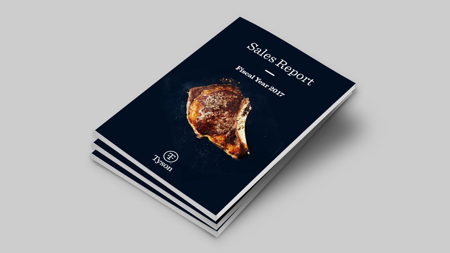


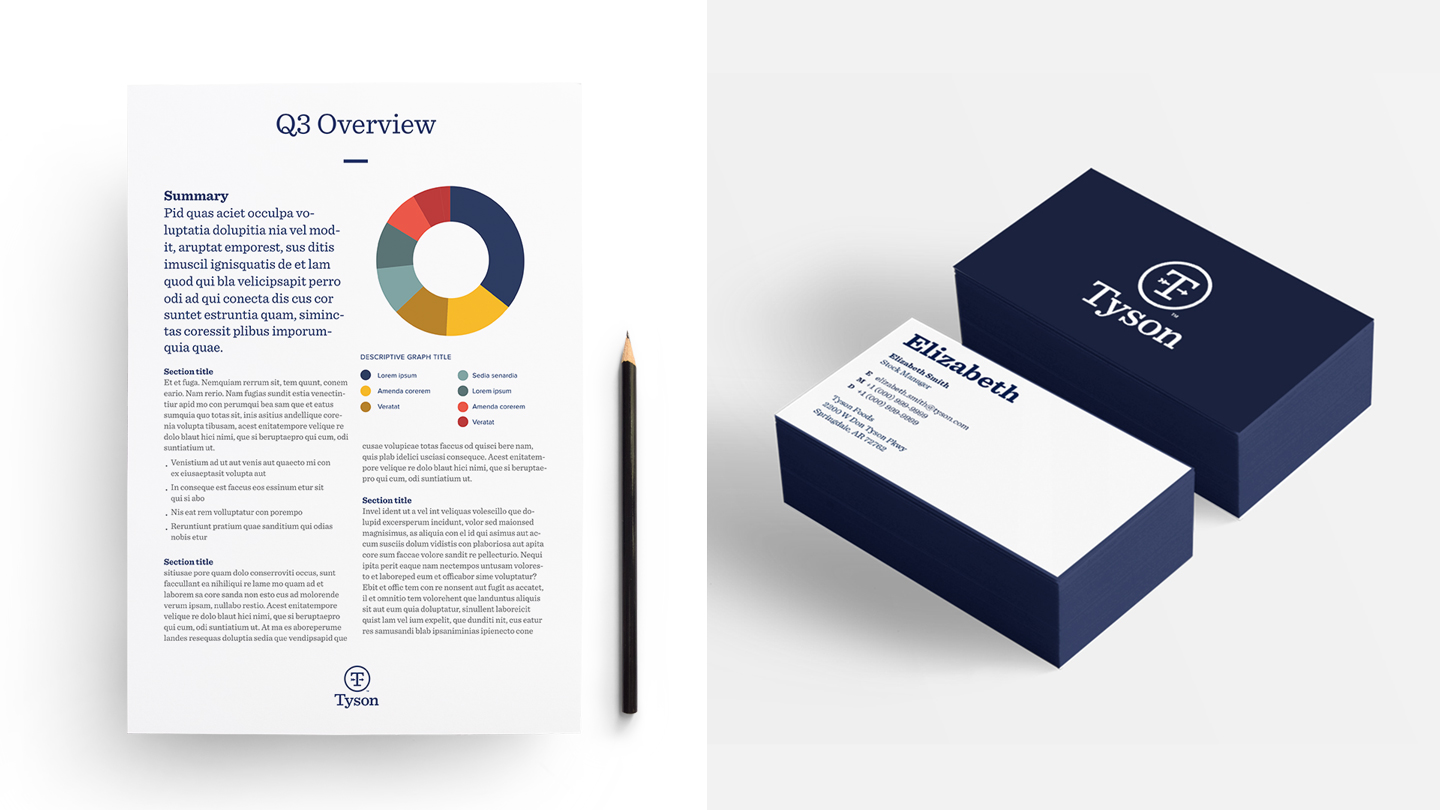


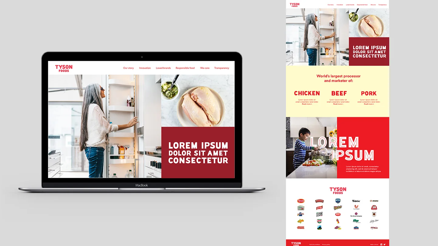
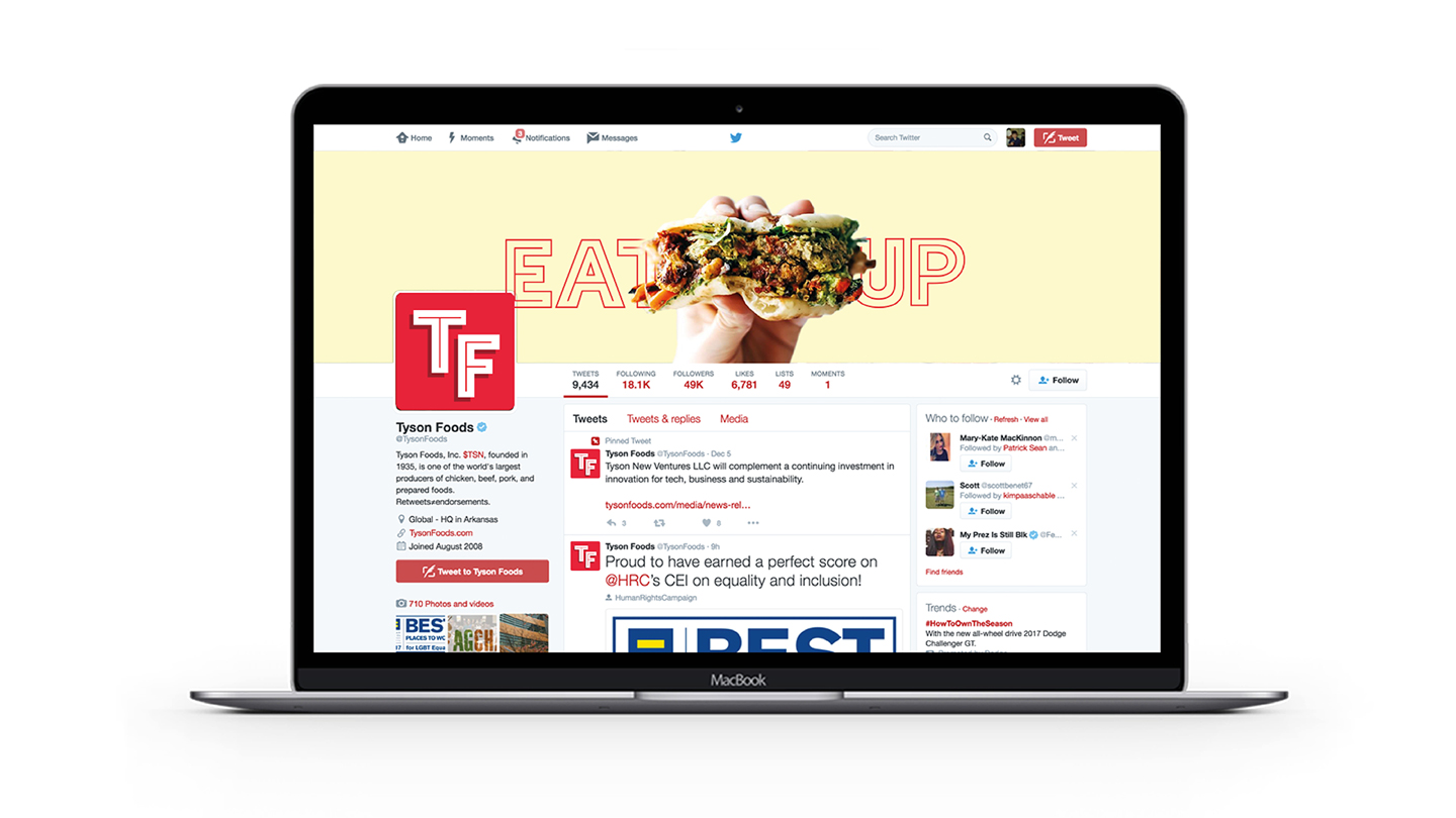
Snippets of the brand guidelines
THE RUNNER-UP
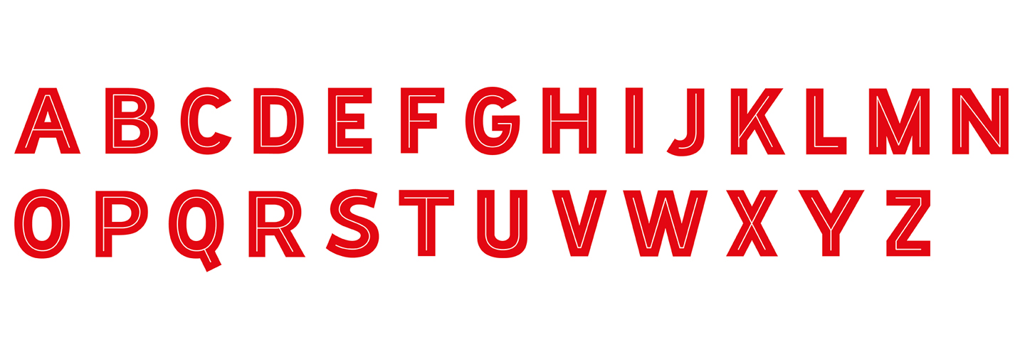
This direction was inspired by the heritage story of the Tyson family and farms. With that, I developed a custom logotype and typeface based on the hand painted letters on John Tyson's first delivery vehicle and used a patchwork quilt-style visual treatment that nodded to farmland and family.
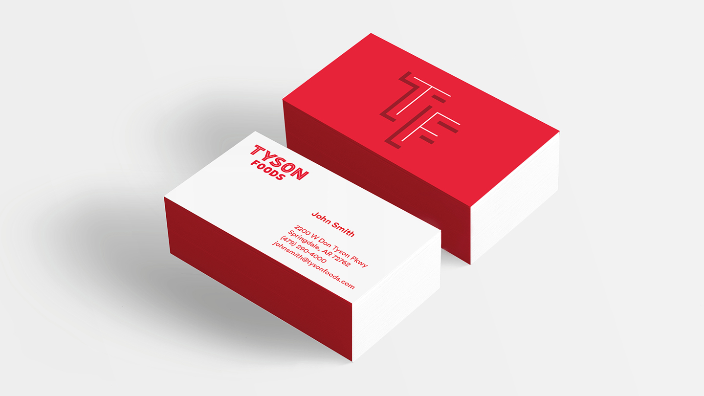
The below is a bit of work from an alternate design system that almost made the cut. While I was not responsible for the final logo above that Tyson Foods selected (just everything that supports it), everything below is my own work and I continue to have a soft spot for it.